
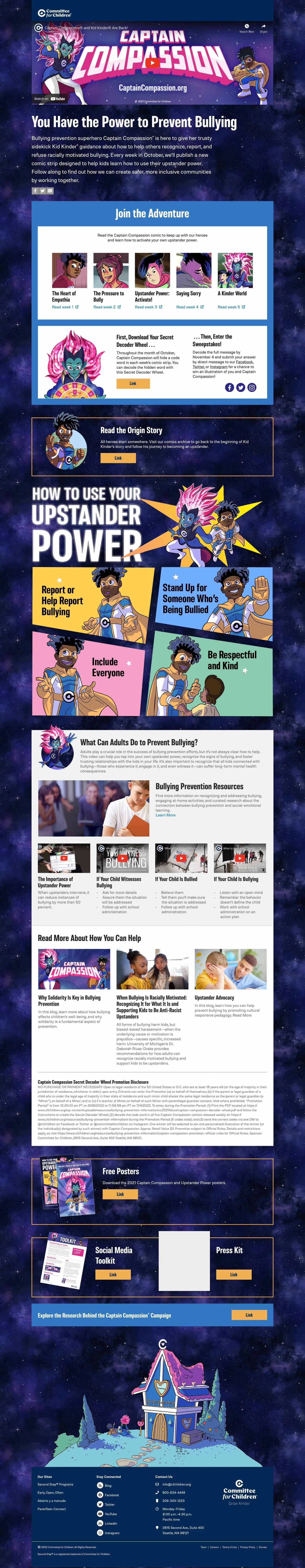
Understanding and Improving an Old Journey
This page layout was a classic case of how-it-has-always-been-done-itis. The PR Communication asked that we clear up the journey steps and hierarchy of the page.
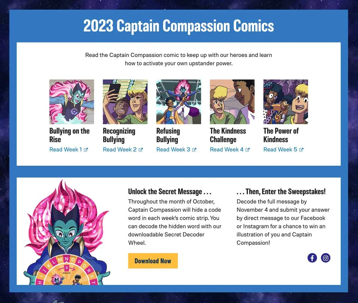
Year over year the submissions were devastatingly low for a sweepstakes, I was tasked to come up with a design solution for this, along with the order of the page. I enlisted the help of a Developer and a UX designer to collaborate on uncovering weaknesses. Together we improved the presentation of the steps to enter sweepstakes by breaking up what was once a paragraph of copy into two paragraphs and two columns, each with a CTA heading and the necessary links for each step. We went from zero submissions to close to two dozen from this change alone. We shared other, larger user journey challenges that we believe would greatly improve submission rates in the future. This project was not only an exciting challenge, it also launched a closer working relationship between Creative and UX departments.
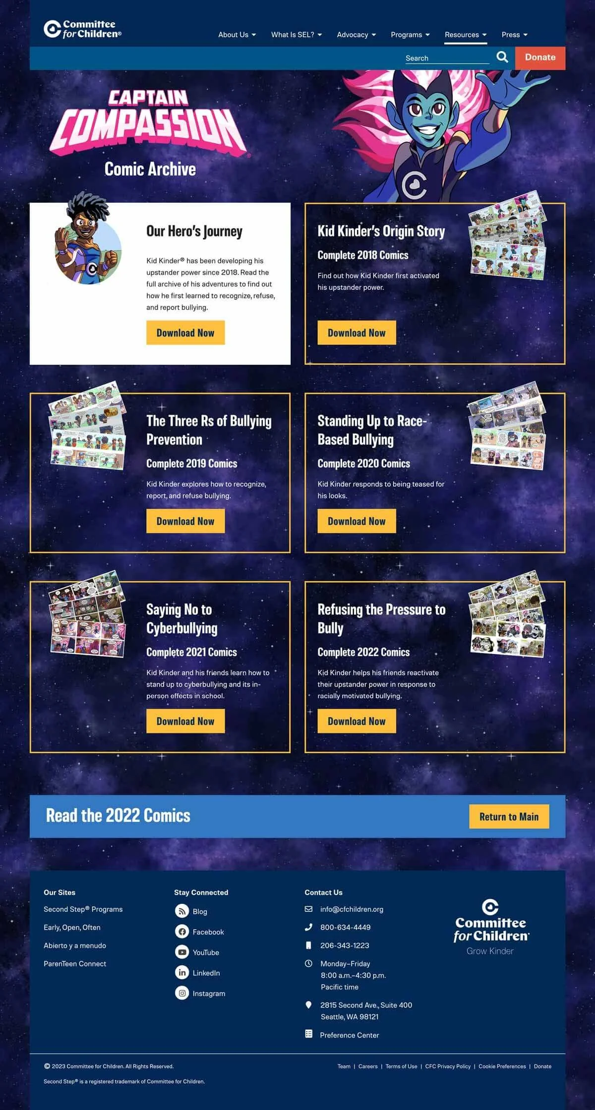
In addition, I designed a clear archive that would improve the page experience and simplify adding content each year. Also making clear how the user can get back to the main comic page.